 Nowadays it's really easy to overlook the value of good signage, or even dismiss it. And that would be a mistake because, in truth, there's a lot going on behind the scenes. Your signage is your business' first impression, and that will directly affect the psychology of your consumers. In the first part of this series, we'll be going over fonts, and how different styles of font can create different impressions on people.
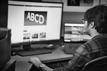
Fonts, as you may know, come in many shapes and sizes. There is such a massive collection of them that picking a style can be very challenging. And though it may seem menial, it is actually one of the most important aspects in controlling a consumer's initial impression of your business. This is because font choice, if done well, is used to compliment your other design choices --which reinforces your brand as a whole. And likewise, poor font choice can actually deter people's intended perception of your business.
When selecting a font, you'll find that there is a multitude of styles to choose from. And all that choice can be overwhelming. Before you decide, ask yourself what exactly you want to convey. What do you want people's impression of your business to be? Different styles of font convey different ideas, and those ideas are what drives your brand.
If you want your business to be perceived as competent, authoritative, or formal, a font in a serif style would suit your needs. Such a font also makes a business seem more safe and trustworthy. Furthermore, sans serif font styles are the modernized alternative to regular serif. It's minimalistic and oftentimes used by tech-centric companies. Script fonts, which mimic cursive, are perceived as more elegant, sophisticated, and personal than other styles. And if you want to make your business seem more jovial and inviting, bubbly or rounded font styles will suit your needs.
 And as a rule, thin-lined fonts are used to convey beauty whereas obscure typefaces convey uniqueness, and slanted letters convey speed.
But in the grand scheme of things, all of these examples are just the tip of the iceberg. There's still plenty of excellent resources on the internet and we encourage you to further explore the ever-evolving world of typography.
Our friends over at Riot Cycle are pleased to welcome any new riders to their state of the art facility --which offers motivational fitness and fun. Their leaders will listen, lead, and inspire you to be your best self.
You can feel safe in the Riot fitness facility as they adhere strictly to the provincial COVID-19 regulations. Riot Cycle is an awesome place to be, if you want to learn more about Riot Cycle or book a class, you can visit their website or any of their other social media accounts.
Riot Cycle Club
734 Osborne St.
Email: info@riotcycleclub.com
Website: https://riotcycleclub.com/
Instagram: https://www.instagram.com/riotcycleclub/
Facebook: https://www.facebook.com/RIOT-Cycle-Club-113170200402252/

.jpg) Michelle works in our accounting office. Her duties include invoicing job and service orders, posting payables, filing various orders into our systems, and entering our timesheets for payroll.
Michelle works in our accounting office. Her duties include invoicing job and service orders, posting payables, filing various orders into our systems, and entering our timesheets for payroll.
Michelle loves to knit while she listens to audiobooks. Her favorite movie series is The Lord of The Rings, and she loves listening to its soundtrack on repeat.
Michelle has been married for 29 years. She has three sons and is soon to be a grandmother. In 2018 she graduated college with honors. She loves to laugh and genuinely cares about others. She always makes it a point to greet everyone when she comes into the office in the morning, and to say goodbye whenever she heads home.
Michelle's personality brightens everyone's day here at Electra Sign and we love having her as part of our team.
To directly speak with a representative, call:
Winnipeg204.452.6168