.jpg&w=650&h=450)
Not every signage project comes with ideal conditions. Some require a bit more problem-solving—and that was exactly the case at Prairie Trail Physiotherapy on Taylor Avenue in Winnipeg.
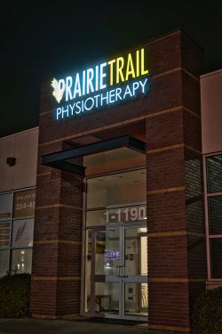 Working within a compact bulkhead, this project involved integrating a detailed logo and clean typography into a limited footprint without sacrificing legibility, especially at night. With LED-lit channel letters, achieving even illumination across intricate shapes can be a challenge. Too much light and finer details wash out. Too little and clarity is lost. This one required a careful balance.
From fabrication through installation, the focus was on precision. Each letter and logo element had to be proportioned and lit in a way that maintained consistency across the entire sign face. The result is a clean, readable installation that holds its presence after dark without overpowering the building façade.
Prairie Trail Physiotherapy is known for its hands-on, active approach to recovery, focusing on movement, education, and personalized treatment plans. Their team works closely with patients to help them understand injuries, build strength, and prevent future issues through guided care and exercise.
That same attention to detail is something we aim to reflect in the signage we build. In this case, it meant ensuring that every part of their brand, from the wheat icon to the letterforms, remains sharp, balanced, and visible at any time of day.
Located at 1190 Taylor Ave, the finished sign fits naturally within the architecture while still standing out where it matters. It is a strong example of how thoughtful design and precise fabrication can turn spatial constraints into a refined final result.
To directly speak with a representative, call:
Winnipeg204.452.6168

---Copy.jpg&w=650&h=450)
.jpg&w=650&h=450)
.jpg&w=650&h=450)