---Copy.jpg&w=650&h=450)
Not every sign tells its story on installation day. Some tell it years later.
Our custom LED illuminated channel letter sign for Phoenix Square, located at 1765 Kenaston Blvd, Unit E in Winnipeg, is a great example of why quality commercial signage is a long term investment.
When this project was fabricated and installed, the goal was simple. Create signage that would provide strong visibility, complement the building's architecture, and continue representing the business well for years to come.
Today, that investment continues to pay off.
The illuminated channel letters remain bright and clean, demonstrating how premium materials, quality LED components, careful fabrication, and professional installation contribute to long lasting performance. While every sign experiences Manitoba's changing seasons, well built signage is designed to withstand those conditions while maintaining its appearance.
For business owners planning new signage, it is worth looking beyond the initial price tag. A sign that continues looking professional years later often provides greater value than one that requires premature repairs or replacement.
At Electra Sign Ltd., we believe every project should be built with longevity in mind. From engineering and fabrication through installation, our team focuses on creating commercial signage that performs just as well years down the road as it does on opening day.
Whether your project calls for LED channel letters, illuminated building signs, monument signs, or custom architectural signage, our goal remains the same. Build quality signage that reflects your business for years to come.
See more completed projects and signage inspiration at https://electrasign.com/news.
.jpg&w=650&h=450)
Every commercial property comes with its own unique set of rules. When business owners look to install exterior branding, they quickly discover that municipal zoning bylaws and landlord lease agreements heavily dictate what can and cannot be placed on a storefront. Navigating these constraints requires a sign partner who understands how to balance strict compliance with strong brand visibility.
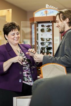 A few months ago, Electra Sign Ltd. completed the fabrication and installation of a new exterior sign package for South Winnipeg Eye Centre, located at 5-1500 Dakota St. For nearly three decades, owner Joceline Krzyszczyk and her dedicated team have provided exceptional eye care and affordable products to the Winnipeg community. When updating the storefront branding for this established clinic, the physical design needed to reflect their professional reputation while adhering strictly to local property guidelines.
The property restrictions for this specific Dakota Street location required a non-lit signage approach. Instead of traditional internal LED illumination, our design and fabrication teams focused on deep dimensional depth. We manufactured high-quality non-lit channel letters that contrast sharply against the building facade. This style utilizes natural daylight and ambient site lighting to create soft, defined shadows, giving the storefront a clean and highly legible appearance.
Whether your business requires a vibrant illuminated display or a sophisticated non-lit solution dictated by landlord constraints, Electra Sign Ltd. provides the technical expertise to guide you through the process. From initial site permits to final installation, we ensure your business stands out while staying fully compliant.
Explore our recent manufacturing projects and find inspiration for your own business exterior by visiting our news section at https://electrasign.com/news
.jpg&w=650&h=450)
At Electra Sign Ltd., building strong customer relationships is just as important as building great signage, and that’s where Derek Olbrycht shines. As an Account Executive, Derek works closely with clients from the initial concept through to the final installation. Whether it’s helping businesses choose the right signage solution, coordinating project details, or guiding customers through the process, Derek focuses on making every project smooth and straightforward.
Now entering his seventh year in the sign industry, Derek brings experience, communication, and a customer-first mindset to every project he’s involved with. His role combines sales, project guidance, and relationship building, helping clients feel confident every step of the way.
Derek grew up between southern Ontario, Montreal, and Winnipeg, giving him a broad perspective and an easygoing personality that helps him connect with people from all walks of life. Outside of work, he enjoys playing hockey, golfing, and spending time at the cottage with family and friends, whether at Hillside or his parents’ lake in southern Ontario.
Family is a huge part of Derek’s life. He describes himself as fun, outgoing, and family-oriented, and says his proudest accomplishment is being a father to his two awesome kids. Another highlight was playing Jr. A hockey, an achievement he still looks back on proudly.
When he’s not working or spending time with family, you’ll probably find Derek watching Game of Thrones or The Office, listening to just about any kind of music except death metal, or enjoying a relaxing day at the lake.
At Electra Sign Ltd., Derek is known for his approachable personality, sense of humour, and dedication to helping customers bring their signage projects to life.
To directly speak with a representative, call:
Winnipeg204.452.6168