
Meet Michelle, a creative and dynamic individual who has always had a passion for both art and business. Michelle grew up in Winnipeg with her three brothers, and today works as a graphic finisher here at Electra Sign, where she applies printed graphics to sign faces among many other tasks that require her finesse.
 Before starting her career in the sign industry, Michelle ran her own wedding and event planning business for over 10 years. In her spare time, Michelle is a jack-of-all-trades, with hobbies ranging from tattooing and digital art to singing and just making noise.
When it comes to entertainment, Michelle is a fan of Gilmore Girls and Mr. Right and enjoys all kinds of music as long as it has a good beat. In school, Michelle's favourite subject was human development and the arts.
Overall, Michelle describes themselves as delightfully chaotic and a "beautiful mess." With a wealth of creativity and energy, there's no telling what this dynamic individual will do next and we are very lucky to have her as part of the Electra Sign Team!
.jpg&w=650&h=450)
The Melody Retirement Community in Waverly Heights, Winnipeg Manitoba is a top-rated assisted living facility for seniors. Located in a beautiful and peaceful neighbourhood, this community offers a wide range of amenities and services to make sure that residents have a comfortable and fulfilling retirement.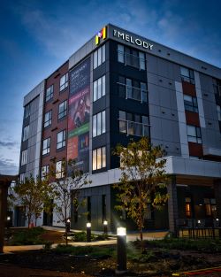 One of the standout features of The Melody Retirement Community is its spacious and well-appointed living quarters. Each apartment is designed with seniors in mind, with features like grab bars, emergency call systems, and wheelchair accessibility. The community also offers a variety of floor plans to suit different needs and preferences, including one and two bedroom apartments, as well as studios.
In addition to comfortable living spaces, The Melody Retirement Community also offers a wide range of activities and amenities to keep residents engaged and active. The community has a fitness center, a swimming pool, a putting green, and a garden for residents to enjoy. There are also regular events and outings organized by the community, such as movie nights, art classes, and group outings to local attractions.
But what really sets The Melody Retirement Community apart is the quality of its care and support services. The community has a team of highly trained and compassionate staff members who are available 24/7 to assist residents with tasks such as bathing, dressing, and medication management. The community also has a nurse on-site at all times, and residents can receive additional medical support through visiting healthcare professionals.
Overall, The Melody Retirement Community in Waverly Heights is a fantastic choice for seniors who are looking for a comfortable, active, and supportive retirement community. If you or a loved one is interested in learning more, we highly recommend reaching out to the community to schedule a tour and see all that it has to offer in person.
GET IN TOUCH!
Leasing Inquiries:
(866) 806-8584
E-mail:
inquiries@themelody.ca
Hours:
Book a tour to see what The Melody is all about. Open for tours 7 days a week. Call to schedule yours today. Or drop in during a Welcome Wednesday Open house every Wednesday from 11am-7pm - no appointment needed!
Address:
920 Chancellor Drive
Winnipeg, MB R3T 6H8
Signage Details: led illum. trim-cap letters and logo / wall mounted / white acrylic faces / c/w vinyl applied as shown / black trims & returns / white leds.
.jpg&w=650&h=450)
 Thom Bargen is inspired by the tireless work of coffee farmers across the world...
Thom Bargen Coffe Roasters strives to make the best coffee they can while honouring the farms they purchase from. They offer freshly brewed coffee, gift cards, coffee subscriptions, merch and brew gear.
743 Corydon Ave is their newest location. With warm wood designed to transition from morning to evening, this spot is cozy. Bright windows line the corner of Cockburn and Corydon creating a real vibe.
THOM BARGEN MISSION:
OVER SEVEN YEARS, ONE FATEFUL BIKE RIDE, A BOARDED-UP BUILDING, THREE COFFEE SHOPS, TRIPS AROUND THE WORLD, AND YEARS OF HARD WORK, WE CAN RESIST NO LONGER.
INSPIRED BY THE TIRELESS WORK OF THE COFFEE FARMERS WE PARTNER WITH ACROSS THE WORLD, OUR PASSION FOR COFFEE HAS LED US TO ROAST. IT’S THOSE FARMERS THAT WE HONOUR WITH THIS BAG. WE HOPE YOU LOVE IT.
Locations:
743 CORYDON: Mon-Fri 7-9, Sat-Sun 8-9
64 SHERBROOK: Mon-Fri 7-5, Sat-Sun 8-5
250 KENNEDY: Mon-Fri 7-4
365 MAIN: permanently closed
www.thombargen.com
Signage Details:
Large Letters: led illum. trim-cap letters / wall mounted / white acrylic faces / black trims & returns / white leds.
Small Letters: non-lit letters acrylic: non. illum. letters / 3/8" thick acrylic / rail mounted to wall surface.
To directly speak with a representative, call:
Winnipeg204.452.6168

---Copy.jpg&w=650&h=450)
.jpg&w=650&h=450)
.jpg&w=650&h=450)