
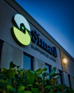
 Since 1987, Simaril Inc. has quietly and consistently made Winnipeg a more inclusive place to call home. Guided by values of respect, empowerment, and unity, the non-profit organization works alongside adults with intellectual and physical disabilities to build independent, meaningful lives across Manitoba. Whether through Residential Living, Supported Independent Living, Home Share, or Respite programs, Simaril focuses on helping people feel connected and valued in their own neighbourhoods.
Earlier this year, our team at Electra Sign Ltd. had the opportunity to help their headquarters at 850 Pembina Hwy A reflect that same warmth and clarity to everyone passing by.
A Smart, Seamless Exterior Refresh When updating commercial building signage, businesses do not always need to start completely from scratch. Simaril already had clean, wall-mounted "Simaril Supported Living" channel letters installed across two elevations of their building, which were still in great working order. However, their accompanying logo emblems were ready for a modern upgrade.
Our goal was to design, fabricate, and install two brand-new LED-illuminated trim-cap logo signs that would replace the older emblems while looking as though they were built alongside the existing letters from day one.
Built for Day and Night Visibility Pembina Highway is one of Winnipeg's busiest corridors, meaning clear legibility at every hour matters. To ensure a cohesive finish across both building elevations, our fabrication team matched the exact material specifications of the existing signage:
Crisp Illumination: High-efficiency white internal LEDs illuminate the new emblems evenly after sundown, creating a welcoming glow without harsh hotspots.
Custom Colour & Contrast: Durable white acrylic faces were finished with precision-cut vinyl in Simaril's signature blue and green brand colours, framed by sleek black trims and returns for sharp daytime contrast against the exterior wall.
Two-Elevation Coverage: Installing the refreshed logo displays on two sides of the facility ensures clear wayfinding for staff, families, community partners, and visitors approaching from multiple directions.
Seeing the finished signs lit up against the evening sky is a great reminder of why we love what we do. Every sign we build tells the story of the people inside, and we are proud to help Simaril continue shining brightly in our community.
Ready to refresh your building's exterior signage? Whether you need a complete custom sign package or a targeted LED upgrade that works with your existing storefront, our Winnipeg team is here to help. Visit electrasign.com to explore our work or start a conversation about your next project.
.jpg&w=650&h=450)
 There's more to a good illuminated sign than simply making sure it lights up.
LED channel letters are a popular choice for commercial buildings because they provide excellent visibility, a clean architectural appearance and plenty of opportunities for custom colours and designs. But not all channel letter signs are made the same way.
A recent project at Harbourfront Wealth, located at 900 Harrow St E in Winnipeg, gives us a good opportunity to look at some of the details that separate a well-made illuminated sign from a lower-quality alternative.
One of the first things people notice about an illuminated sign is how bright it is. But brightness alone isn't a good measure of quality.
A properly fabricated LED channel letter sign should have consistent illumination throughout each letter. You shouldn't see distracting bright spots, dark patches or noticeable differences in brightness between individual letters.
This comes down to thoughtful LED placement, the right components and proper attention during fabrication.
When everything is working together, the result is a clean, even appearance that makes the lettering easy to read and gives the sign a more professional finish.
Channel letters are three-dimensional fabricated letters, typically made with formed metal returns and an illuminated face.
While the finished face is what everyone sees, much of the quality comes from the construction behind it.
A few things worth considering include:
LED quality and placement: Properly selected and positioned LEDs help provide consistent illumination and dependable performance.
Letter construction: Clean fabrication, accurate dimensions and properly assembled components contribute to the overall appearance and durability.
Electrical components: Quality power supplies and appropriate electrical connections are important for reliable operation.
Weather protection: In Winnipeg, signs need to withstand considerable temperature changes, moisture, snow and seasonal weather conditions. Proper construction and protection matter.
Colour consistency: Matching the intended colour and maintaining a consistent appearance across all the letters helps create a more polished result.
These aren't necessarily the details that catch your eye when you first see a sign, but they're important to how it performs over time.
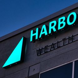
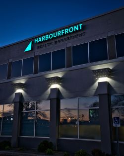 The LED illuminated channel letters installed at Harbourfront Wealth on Harrow Street feature the company's distinctive turquoise lettering and triangular logo.
The illuminated elements provide a strong contrast against the building's exterior, making the signage particularly noticeable after sunset.
Harbourfront Wealth takes an independent approach to financial advice, with an emphasis on personalized wealth planning, risk management and long-term client relationships. Its signage provides a clear identity for the Winnipeg location while complementing the building's architecture.
It's a good example of how thoughtful signage can help a business establish a recognizable presence without making the design unnecessarily complicated.
When comparing quotes for LED channel letter signage, it's worth asking what's actually included.
Two signs might have similar dimensions, colours and designs on paper, but there can be considerable differences in the materials, LED systems, fabrication methods and electrical components being used.
A lower-priced sign isn't automatically a poor-quality sign, just as a higher-priced sign isn't automatically better. The important thing is understanding what you're getting.
Ask about the LED components, construction methods, warranty coverage and expected maintenance requirements. These details can help you make a more informed decision and avoid surprises down the road.
At Electra Sign, we believe good signage starts with getting the details right. A sign should look good when it's first installed, but it should also be built with the expectation that it will be doing its job for years to come.
Looking for illuminated channel letters or other commercial signage in Winnipeg?
Visit Electra Sign Ltd. to see more of our completed projects and learn about our signage services.

Crafting Curb Appeal for a Winnipeg Community Hub
Every memorable local business has a story that connects deeply with its neighborhood. For The Getaway Cafe, located at 1500 Dakota Street in St. Vital, that story began back in 2004. Starting out as "Dina’s Place" in the Waverly Auto Mall, owner Dina built a loyal following through hearty, homemade recipes like her signature Reuben sandwiches, fresh soups, and wraps.
Over the years, that passion for hospitality expanded into what is now The Getaway Cafe, a lively venue combining exceptional comfort food, Royal Pizza, and a stage for local musicians and stand-up comedians.
A few months ago, the team at Electra Sign Ltd had the opportunity to collaborate with The Getaway Cafe to update their exterior visual presentation.
 - Copy.jpg) Thoughtful Design and Precision Installation
When designing commercial exterior signage, taking existing building architecture into account is essential. The Getaway Cafe features warm exterior wall finishes paired with pre-installed overhead gooseneck lighting fixtures.
Rather than overloading the facade with internal illumination, we designed custom non-illuminated dimensional channel letters.
High Contrast and Readability: Crisp black dimensional lettering provides maximum visual impact against the neutral building background during daytime hours.
Architectural Integration: The placement was strategically calibrated to work directly under the existing overhead lights, casting subtle natural shadows during the day and gaining sharp illumination at night.
Durable Construction: Built with high-grade materials engineered to withstand Winnipeg’s harsh seasonal weather shifts, ensuring long-term aesthetic quality.
Supporting Local Businesses Across Manitoba
A business sign is often the very first physical touchpoint a customer experiences. For a venue like The Getaway Cafe, where community gatherings and warm hospitality are central to the brand, clean and professional signage reinforces trust before a guest even walks through the door.
We are proud to have partnered with Dina and the team at The Getaway Cafe to bring their storefront vision to life. Next time you are in St. Vital enjoying a midday meal or evening performance, take a look up at the facade!
Planning a signage update for your local business? Explore our full gallery of custom channel letters, pylon signs, and commercial installations, or contact our team today to discuss your vision.
To directly speak with a representative, call:
Winnipeg204.452.6168

.jpg&w=650&h=450)