For churches, communication extends far beyond Sunday morning. Worship services, youth programs, community breakfasts, seasonal events, retreats, and volunteer opportunities all depend on keeping people informed.
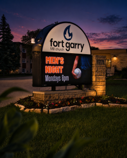 Fort Garry Mennonite Fellowship Church has been doing exactly that for decades. Since its beginnings in the late 1960s, the congregation has grown from a small group meeting in rented facilities to an established church serving approximately 200 members from its home on Bayridge Avenue in Winnipeg.
To support that ongoing communication, Electra Sign Ltd. fabricated and installed a custom Electronic Message Centre monument sign that combines permanent branding with flexible digital messaging.
Unlike traditional signs that remain unchanged for years, an Electronic Message Centre gives organizations the ability to update information whenever needed. Whether announcing worship times, promoting youth activities, inviting the community to seasonal celebrations, or sharing special events, the display keeps messages current while maintaining a professional appearance.
For organizations like Fort Garry Mennonite Fellowship Church, the sign serves as more than an identifier. It is another way to connect with neighbours, welcome new visitors, and keep the surrounding community informed about what's happening throughout the year.
A well designed monument sign creates a lasting first impression, while the digital display ensures that message continues to evolve with the organization it represents.
At Electra Sign Ltd., we enjoy building signage that supports not only our clients' brands, but also the communities they serve.
Learn more about our custom signage projects at https://electrasign.com/news.
.jpg&w=650&h=450)
As businesses grow to multiple locations, maintaining a consistent brand experience becomes increasingly important. While customers may focus on the food or service, the first impression often begins outside with the signage.
 Electra Sign Ltd. was proud to fabricate and install the LED channel letter signage for every Jimmy John's Sandwiches location in Winnipeg. From the Canadian first drive thru restaurant on Pembina Highway to locations on Broadway, Grant Avenue, and Ellice Avenue, each storefront was designed to reflect the same recognizable brand identity.
For companies with multiple locations, working with one experienced sign company offers significant advantages beyond appearance.
Consistent fabrication methods help ensure every sign matches the brand's specifications. A single point of contact simplifies communication throughout the project, while coordinated scheduling helps installations move efficiently as new locations open. Long term maintenance and future additions also become much easier when the same team understands the brand standards from day one.
Rather than sourcing signage from different suppliers for each project, partnering with one trusted manufacturer creates a more consistent customer experience while reducing administrative complexity.
Restaurant signage also faces unique demands. Illuminated LED channel letters need to perform reliably through Winnipeg's changing seasons while maintaining excellent visibility during both daytime and nighttime hours. Our fabrication team builds every project with durability, precision, and long-term performance in mind.
Whether a business is opening its first location or expanding across the city, consistent signage helps reinforce the brand every time customers arrive.
Electra Sign Ltd. is proud to support growing businesses with custom commercial signage, LED channel letters, sign fabrication, professional installation, and ongoing service throughout Winnipeg and Manitoba.
Winnipeg sign company, LED channel letters, restaurant signage, commercial signs Winnipeg, illuminated business signs, franchise signage, custom signs Winnipeg, sign fabrication, sign installation, storefront signage.
.jpg&w=650&h=450)
Clear identification is an important part of creating a welcoming environment, especially for businesses and organizations that serve families every day. For this project, Electra Sign Ltd. fabricated and installed custom non-lit channel letters for the Kumon River Park Centre, located at 1500 Dakota Street, Unit 8 in Winnipeg.
 Designed to reflect Kumon's recognizable global brand, the dimensional lettering provides a clean, professional appearance that complements the building's architecture. Non-lit channel letters are a popular choice for businesses looking for a durable, low-maintenance signage solution with strong daytime visibility and a polished, three-dimensional look.
The River Park Centre is led by instructor and owner Monika Bernatek, who has spent more than 17 years helping students build confidence through individualized math and reading instruction. Her approach focuses on developing independent learners while supporting families with personalized study plans that allow each student to progress at their own pace.
It is rewarding to know that the signage continues to welcome students and parents as they arrive for classes, serving as a lasting part of a centre dedicated to education and lifelong learning.
Projects like this highlight how thoughtful sign fabrication can reinforce a trusted brand while creating a professional first impression that lasts for years.
If your business, school, or organization is planning new custom channel letters, commercial building signage, or dimensional exterior signs in Winnipeg, Electra Sign Ltd. can help bring your vision to life.
See more completed projects and sign solutions at https://electrasign.com/news.
To directly speak with a representative, call:
Winnipeg204.452.6168