.jpg&w=650&h=450)
 There's more to a good illuminated sign than simply making sure it lights up.
LED channel letters are a popular choice for commercial buildings because they provide excellent visibility, a clean architectural appearance and plenty of opportunities for custom colours and designs. But not all channel letter signs are made the same way.
A recent project at Harbourfront Wealth, located at 900 Harrow St E in Winnipeg, gives us a good opportunity to look at some of the details that separate a well-made illuminated sign from a lower-quality alternative.
One of the first things people notice about an illuminated sign is how bright it is. But brightness alone isn't a good measure of quality.
A properly fabricated LED channel letter sign should have consistent illumination throughout each letter. You shouldn't see distracting bright spots, dark patches or noticeable differences in brightness between individual letters.
This comes down to thoughtful LED placement, the right components and proper attention during fabrication.
When everything is working together, the result is a clean, even appearance that makes the lettering easy to read and gives the sign a more professional finish.
Channel letters are three-dimensional fabricated letters, typically made with formed metal returns and an illuminated face.
While the finished face is what everyone sees, much of the quality comes from the construction behind it.
A few things worth considering include:
LED quality and placement: Properly selected and positioned LEDs help provide consistent illumination and dependable performance.
Letter construction: Clean fabrication, accurate dimensions and properly assembled components contribute to the overall appearance and durability.
Electrical components: Quality power supplies and appropriate electrical connections are important for reliable operation.
Weather protection: In Winnipeg, signs need to withstand considerable temperature changes, moisture, snow and seasonal weather conditions. Proper construction and protection matter.
Colour consistency: Matching the intended colour and maintaining a consistent appearance across all the letters helps create a more polished result.
These aren't necessarily the details that catch your eye when you first see a sign, but they're important to how it performs over time.
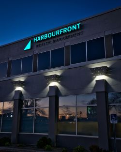 The LED illuminated channel letters installed at Harbourfront Wealth on Harrow Street feature the company's distinctive turquoise lettering and triangular logo.
The illuminated elements provide a strong contrast against the building's exterior, making the signage particularly noticeable after sunset.
Harbourfront Wealth takes an independent approach to financial advice, with an emphasis on personalized wealth planning, risk management and long-term client relationships. Its signage provides a clear identity for the Winnipeg location while complementing the building's architecture.
It's a good example of how thoughtful signage can help a business establish a recognizable presence without making the design unnecessarily complicated.
When comparing quotes for LED channel letter signage, it's worth asking what's actually included.
Two signs might have similar dimensions, colours and designs on paper, but there can be considerable differences in the materials, LED systems, fabrication methods and electrical components being used.
A lower-priced sign isn't automatically a poor-quality sign, just as a higher-priced sign isn't automatically better. The important thing is understanding what you're getting.
Ask about the LED components, construction methods, warranty coverage and expected maintenance requirements. These details can help you make a more informed decision and avoid surprises down the road.
At Electra Sign, we believe good signage starts with getting the details right. A sign should look good when it's first installed, but it should also be built with the expectation that it will be doing its job for years to come.
Looking for illuminated channel letters or other commercial signage in Winnipeg?
Visit Electra Sign Ltd. to see more of our completed projects and learn about our signage services.

Some signage projects require a little more patience and problem-solving than others. Our work for Medigas Manitoba at Linden Ridge Shopping Centre in Winnipeg South was one of those projects.
The finished installation features illuminated channel letters, the distinctive green Medigas logo, and the tagline "Manitoba's CPAP Experts." While the completed sign looks straightforward from the parking lot, getting there involved some careful work behind the scenes.
Working Through the Details
The Medigas logo was the most intricate part of this project. Its many small green elements required additional attention during fabrication to maintain the appearance and proportions of the original design. Translating a detailed graphic into physical illuminated signage is not always as simple as scaling it up. Individual components, spacing, construction and lighting all need to work together.
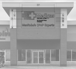 Our team worked through those challenges during the build and installation, making sure the finished sign represented the Medigas identity properly.
The result is a clean, illuminated storefront sign that gives the business a clear presence both during the day and after dark.
A Manitoba Business with a Long History
Medigas Manitoba Ltd. is a locally owned and family-operated business that has been serving customers for more than 35 years.
The company specializes in respiratory care, CPAP supplies, sleep therapy, EMS and rehabilitative medicine. Its professional team includes people with backgrounds in respiratory therapy, nursing, sleep therapy and technical services.
For people managing sleep apnea or requiring respiratory equipment, having access to knowledgeable local support can make a real difference. Medigas also provides technical service and support for healthcare and clinic facilities.
It's a well-established Manitoba business with a focus on helping people find the equipment, products and assistance they need.
A Finished Sign We're Proud Of
The Medigas project was a good example of the care that goes into custom sign fabrication. The intricate logo presented a few challenges, but the team came through and the finished installation looks great.
We're pleased to have helped Medigas Manitoba establish its presence at Linden Ridge Shopping Centre and to see the finished signage representing a local business with such a long history in our community.
Project: Medigas Manitoba Ltd.
Location: Linden Ridge Shopping Centre, Winnipeg South, Manitoba
Sign Type: LED Illuminated Channel Letters and Custom Logo Signage
Fabrication and Installation: Electra Sign Ltd.
Visit Medigas Manitoba to learn more about its respiratory care and CPAP services.
See more of our commercial signage projects at electrasign.com.

There are times when a business sign doesn't need to be complicated to make an impression.
Performance Chiropractic Health and Wellness Center has been serving patients from its location at 1-1500 Dakota St. in Winnipeg for years. The clinic offers chiropractic care along with services including acupuncture, massage therapy and custom orthotics.
For the exterior of the building, Electra Sign Ltd. fabricated and installed custom non-lit channel letters featuring the Performance Chiropractic name and distinctive red and black logo.
 - Copy - Copy.jpg) A simple approach to exterior signage
The Performance Chiropractic logo has a strong graphic quality, with the red symbol providing a natural focal point against the black lettering. Rather than adding unnecessary elements, the signage lets the existing branding do most of the work.
The dimensional channel letters give the lettering depth and definition, helping it stand out from the textured building façade during the day.
This is one of the advantages of non-illuminated channel letters. When the logo, colour contrast, scale and placement are working together, a sign can have plenty of presence without needing to be illuminated.
Reflecting the business
Performance Chiropractic describes its approach around Koren Specific Technique, a form of chiropractic care that the clinic says uses gentle, specific corrections rather than twisting, turning or traditional joint cracking.
The clinic also provides acupuncture, massage therapy and custom orthotics, giving the business a broader health and wellness focus.
For a business like this, exterior signage is more than simply displaying a name. It is one of the first things patients see when they arrive and helps establish a clear connection between the business and its location.
.jpg) A good fit for 1500 Dakota Street
The finished Performance Chiropractic signage is a relatively straightforward project, but that's part of what makes it work. The red and black branding is easy to recognize, the dimensional letters add visual interest, and the overall installation fits comfortably with the building's exterior.
Electra Sign Ltd. designs, fabricates and installs custom commercial signage for businesses throughout Winnipeg and Manitoba. From non-lit channel letters to illuminated signs, monument signs and other custom signage solutions, each project starts with finding an approach that makes sense for the business, the building and the location.
See more of our projects at electrasign.com/news
To directly speak with a representative, call:
Winnipeg204.452.6168

.jpg&w=650&h=450)
