.jpg&w=650&h=450)
A Winnipeg Original Gets a Sign to Match
Some businesses become part of the landscape of a city. The Original Royal Pizza is one of them.
Family-owned and operated since 1975, Royal Pizza has built a long-standing following in Winnipeg with handmade pizza, its original dough and signature sauce recipes. The restaurant's River Park South location at 1500 Dakota Street offers takeout, delivery, full-service dining and live local musical entertainment.
For this project, Electra Sign Ltd. fabricated and installed custom non-lit channel letters for the exterior of The Original Royal Pizza.
The dimensional lettering was designed to give the restaurant's established identity a strong presence on the building while working naturally with the existing architecture. Non-lit channel letters also provide a clean, dimensional appearance during the day without relying on illumination.
 Keeping a Familiar Name Familiar
One of the interesting things about signage projects for long-established businesses is that the brand already has plenty of history behind it.
Royal Pizza isn't trying to look like a brand-new restaurant. The goal is to maintain the character people recognize while making sure the business is clearly identified from the street.
That's where dimensional channel letters can work particularly well. The individual letters create depth, shadows and definition against the building facade, giving a relatively straightforward sign more visual character.
And in this case, there is plenty of character behind the name.
Royal Pizza continues to make its pizzas using its original dough and sauce recipes, along with fresh local ingredients. Their current menu includes everything from the Royal Special, created in 1975, to Mediterranean, Greek, Veggie Lovers and other favourites.
A Small Part of a Long Winnipeg Story
We enjoy projects like this because the finished sign is only one part of the story.
The Original Royal Pizza has been serving Winnipeg for more than five decades. Our role was simply to fabricate and install signage that fits comfortably into that story and gives the restaurant a strong presence at its Dakota Street location.
The sign may be newer, but the name on it has been around for a long time.
.jpg&w=650&h=450)
When a business has a strong personality, its signage should reflect it.
That was the thinking behind the exterior signage Electra Sign Ltd. fabricated and installed for Pinseekers Golf Lounge Winnipeg at 1045 St James St.
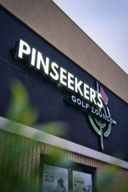 Pinseekers is not simply a place to practice a few swings. The Winnipeg indoor golf lounge combines simulator golf with a relaxed social atmosphere, making it a destination for golfers and non-golfers alike. Their St. James location offers an indoor setting where people can play, enjoy food and drinks, and spend time with friends.
The exterior signage needed to fit that personality.
Electra Sign fabricated and installed illuminated LED channel letters spelling out PINSEEKERS, along with the distinctive golf-themed logo and supporting GOLF LOUNGE lettering. The combination gives the building a strong visual identity while making the business easy to recognize from outside.
The illuminated letters are particularly effective as part of the overall storefront. During the evening, the bright white lettering stands out against the darker exterior, while the dimensional golf logo adds another layer of visual interest.
For a business like Pinseekers, the sign also communicates something about the experience. The golf imagery immediately establishes the theme, while the larger lounge-style presentation suggests that this is about more than simply hitting golf balls.
Pinseekers now has two Manitoba locations, including the St. James location at 1045 St James St and its South Landing location in Oak Bluff.
We enjoyed working on a project where the signage could be just as energetic and recognizable as the business itself.
.jpg&w=650&h=450)
A restaurant's first impression begins long before guests see a menu. The storefront is often the first interaction customers have with a business, making professionally designed signage an important part of the overall experience.
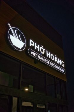 Electra Sign Ltd. was proud to fabricate and install these custom LED-lit channel letters for Pho Hoang Restaurant in Winnipeg. Positioned prominently on the building façade, the illuminated signage provides excellent visibility while reinforcing the restaurant's clean, contemporary identity during both the day and evening.
Since opening its first location in 2011, Pho Hoang has grown to four locations across Winnipeg. Founded by Tom Hoang, the restaurant combines contemporary Vietnamese flavours inspired by his travels with traditional family recipes, creating a dining experience that has earned a loyal following throughout the city.
The signage was designed to complement that modern atmosphere. Crisp white LED illumination, bold channel letter construction, and the distinctive bowl logo work together to create an inviting entrance that catches attention without overwhelming the building's architecture.
At Electra Sign Ltd., we enjoy working with businesses that value the customer experience from the moment someone arrives. Thoughtfully fabricated signage not only improves visibility, it helps communicate the personality of the business before customers even step inside.
Whether it's a restaurant, retail store, office, or commercial development, quality LED channel letter signage continues to be one of the most effective ways to strengthen a brand and create a lasting first impression.
To learn more about our custom commercial signage projects, visit https://electrasign.com/news or explore our portfolio at https://electrasign.com.
To directly speak with a representative, call:
Winnipeg204.452.6168

.jpg&w=650&h=450)
.jpg&w=650&h=450)
.jpg&w=650&h=450)