.jpg&w=650&h=450)
A Winnipeg Original Gets a Sign to Match
Some businesses become part of the landscape of a city. The Original Royal Pizza is one of them.
Family-owned and operated since 1975, Royal Pizza has built a long-standing following in Winnipeg with handmade pizza, its original dough and signature sauce recipes. The restaurant's River Park South location at 1500 Dakota Street offers takeout, delivery, full-service dining and live local musical entertainment.
For this project, Electra Sign Ltd. fabricated and installed custom non-lit channel letters for the exterior of The Original Royal Pizza.
The dimensional lettering was designed to give the restaurant's established identity a strong presence on the building while working naturally with the existing architecture. Non-lit channel letters also provide a clean, dimensional appearance during the day without relying on illumination.
 Keeping a Familiar Name Familiar
One of the interesting things about signage projects for long-established businesses is that the brand already has plenty of history behind it.
Royal Pizza isn't trying to look like a brand-new restaurant. The goal is to maintain the character people recognize while making sure the business is clearly identified from the street.
That's where dimensional channel letters can work particularly well. The individual letters create depth, shadows and definition against the building facade, giving a relatively straightforward sign more visual character.
And in this case, there is plenty of character behind the name.
Royal Pizza continues to make its pizzas using its original dough and sauce recipes, along with fresh local ingredients. Their current menu includes everything from the Royal Special, created in 1975, to Mediterranean, Greek, Veggie Lovers and other favourites.
A Small Part of a Long Winnipeg Story
We enjoy projects like this because the finished sign is only one part of the story.
The Original Royal Pizza has been serving Winnipeg for more than five decades. Our role was simply to fabricate and install signage that fits comfortably into that story and gives the restaurant a strong presence at its Dakota Street location.
The sign may be newer, but the name on it has been around for a long time.

Some restaurant brands are instantly recognizable, even from across a parking lot. Popeyes Louisiana Kitchen has spent more than 50 years building that kind of recognition through bold colours, memorable branding, and a reputation for Cajun inspired flavour.
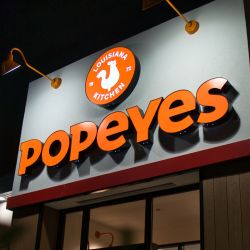 Electra Sign Ltd. was pleased to fabricate and install the LED lit channel letters for this Popeyes location. The finished signage features illuminated dimensional letters and the iconic Popeyes logo, creating a storefront that remains bright, welcoming, and easy to identify after sunset.
While great food brings customers back, great signage helps bring them through the door in the first place. Clear visibility, consistent branding, and quality craftsmanship all contribute to a positive first impression. The illuminated orange letters complement the building's modern architecture while providing excellent readability from nearby roadways and parking areas.
Founded in New Orleans in 1972, Popeyes has grown from a single restaurant into one of the world's most recognizable quick service brands. Maintaining a consistent visual identity across locations is an important part of that success, and professionally fabricated LED channel letters help reinforce that identity every day and night.
At Electra Sign Ltd., we enjoy working with businesses whose brands are known for making an impression. Projects like this demonstrate how quality illuminated signage supports customer recognition while enhancing the overall appearance of a commercial property.
Explore more completed projects and signage solutions at https://electrasign.com/news.

For churches, communication extends far beyond Sunday morning. Worship services, youth programs, community breakfasts, seasonal events, retreats, and volunteer opportunities all depend on keeping people informed.
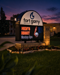 Fort Garry Mennonite Fellowship Church has been doing exactly that for decades. Since its beginnings in the late 1960s, the congregation has grown from a small group meeting in rented facilities to an established church serving approximately 200 members from its home on Bayridge Avenue in Winnipeg.
To support that ongoing communication, Electra Sign Ltd. fabricated and installed a custom Electronic Message Centre monument sign that combines permanent branding with flexible digital messaging.
Unlike traditional signs that remain unchanged for years, an Electronic Message Centre gives organizations the ability to update information whenever needed. Whether announcing worship times, promoting youth activities, inviting the community to seasonal celebrations, or sharing special events, the display keeps messages current while maintaining a professional appearance.
For organizations like Fort Garry Mennonite Fellowship Church, the sign serves as more than an identifier. It is another way to connect with neighbours, welcome new visitors, and keep the surrounding community informed about what's happening throughout the year.
A well designed monument sign creates a lasting first impression, while the digital display ensures that message continues to evolve with the organization it represents.
At Electra Sign Ltd., we enjoy building signage that supports not only our clients' brands, but also the communities they serve.
Learn more about our custom signage projects at https://electrasign.com/news.
To directly speak with a representative, call:
Winnipeg204.452.6168

.jpg&w=650&h=450)
.jpg&w=650&h=450)
.jpg&w=650&h=450)